
Brand
The Urban Oasis - Youth Sub-Branding
Scope of Work
Visual Identity, Logo Design, Packaging Design, Poster Design, Stationery Design, Typography, Color Palette Design


Logo Design
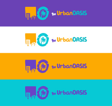
We began by designing a youth variation of the Urban Oasis logo that felt more modern and playful. We really wanted it to emit vibes of the Oasis being an exciting paradise of escape, wonder, and imagination.
Both letters retained the imagery from the Original Logo, with the letter 'U' having the silhouette of city buildings, and the letter 'O' having the silhouette of a tropical paradise. The letterforms themselves have been made to look more organic, natural, and unrestricted just as youth are.
Brand Colors

The sub-brand's color palette was designed with Paradise in mind while also taking into consideration the African American and Hispanic target demographic. The original brand's purple has been boosted to be more vibrant, fun, and soothing. Additional colors have been added to give the sub-brand more versatility, personality, and impact.
Visual Elements


The sub-brand's visual elements consist of illustrations and shapes that each highlight a unique aspect of the Urban Oasis' mission and vision:
The filled-in letter 'U' frame shapes represent windows that capture moments of the people around us.
The stylized 'O' shapes and half-shapes represent the unpredictable and exciting nature of real community life and the future.
The palm tree represents the Oasis as a place of refuge and peace for the community and its people.
A silhouette of a girl using her imagination which is what the UO inspires each child to do.
A silhouette of a boy reaching for the stars. The Urban Oasis is a place where dreams are taught to dream big!
A silhouette of two children holding hands. We can only succeed by working together and supporting one another.
Brand Fonts and Typography


The sub-brand consists of 3 fonts, two standalone fonts, and a mixed typeface comprised of those two.
The primary font is the sans-serif font 'Urbanist', useful for most use cases in titles, subtitles, headings, paragraphs, and all else.
The secondary font is the fun and rounded sans serif font 'Willinicki' which should be used sparingly for large display text such as large titles, quotes, and other standalone text.
The tertiary or accent font combines Urbanist and Willinicki into a new mixed font 'williUrbanist' which is used for special titles, and in most cases 'Willinicki' should proceed 'Urbanist'.
Marketing Materials


Posters
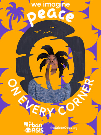
We created posters for an initial marketing campaign that utilize the stylized letter 'U' and 'O' from the logo which are used as frames for images. These create deeper connection the Urban Oasis brand in the mind of the audience while also captivating the viewer.

The stylized letter ‘U’ can be used as a picture frame, and is very effective in communicating the idea of a city that is built up of people.

The stylized letter ‘O’ can be used as a picture frame that communicates the idea of the Urban Oasis as a place of peace, rejuvenation and imagination.


Apparel
We designed a t-shirt and tote bag for the sub-brand using its visual elements. Both the client and ourselves were especially pleased with the striking design of the t-shirt which truly captures the essence of the Urban Oasis at a single glance. The individual wearing this shirt is inviting anyone around them is intrigued to explore the wonder of the Urban Oasis.


Find Out More
To learn more about the Urban Oasis and support their revitalization of Baltimore City, visit www.theurbanoasis.org